Helvetica
Plot
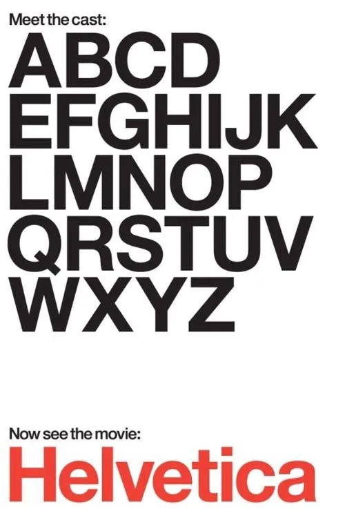
Helvetica is a film that transcends mere typography, delving into the realm of global visual culture and its profound impact on our lives. Director Gary Hustwit's documentary is an ode to the simplicity and elegance of one of the most ubiquitous typefaces in the world – Helvetica. Released in 2007, the film marks the 50th anniversary of this iconic font, born out of the need for a rational and functional text to be used in the German railway system during the 1950s. The film begins by examining the birth of Helvetica, formerly known as Neue Haas Grotesk, at Haas'sche Schriftgiesserei in Switzerland. It was here that the German designer Max Miedinger refined the original design, creating a font that would become synonymous with modernity and efficiency. Helvetica's widespread adoption in the mid-20th century can be attributed to its clean, sans-serif design, perfectly suited for the emerging digital age. As we delve deeper into the film, the lens shifts from the historical context to the modern-day proliferation of Helvetica. Hustwit takes us on a tour of major cities around the world, from New York to Los Angeles, Paris to Tokyo, and London to Berlin, exploring the urban spaces that bear the indelible mark of Helvetica. From giant digital billboards to humble street signs, the typeface is omnipresent, casting a ubiquitous visual landscape over the metropolis. However, Helvetica is not merely a passive observer in these urban spaces. The film's narrative weaves a rich tapestry of conversations with renowned designers, including Paula Scher, Massimo Vignelli, and Adrian Frutiger. Each interviewee brings a unique perspective to the discussion, shedding light on the creative process, and the choices behind their use of Helvetica. Paula Scher, the design director at Pentagram, recounts the pivotal moment when she decided to use Helvetica in her now-iconic 1985 signage for the Museum of Modern Art in New York. The clean, minimal aesthetic struck a chord with Scher, resonating with her vision of a modern city. In her words, "Helvetica is a great word, just great... I love Helvetica as a word, and I love it as a typeface." Meanwhile, Massimo Vignelli, an Italian designer who, along with his wife Lella, pioneered the concept of corporate identity, recalls his pivotal role in popularizing Helvetica in the United States. The couple's work for the United States Transit Authority (1960-1970) introduced the typeface to a broader American audience, catapulting it to global fame. Vignelli praises Helvetica's "neutrality and versatility," arguing that it has become the "lingua franca" of modern design. Adrian Frutiger, another Swiss design legend, shares his reservations about Helvetica, citing its limitations as a functional font. Frutiger prefers the beauty and elegance of his own Frutiger design, created for the International Organization for Standardization in 1976. Despite their differing opinions, all interviewees agree on the impact of Helvetica on modern design. As the film unfolds, we are treated to a visual feast, witnessing the intricate dance of Helvetica in urban landscapes. Whether it's the bold, digital display of Broadway billboards or the discreet, printed signs on public transportation, the typeface is an ever-present companion to our daily lives. Helvetica's ability to transcend language barriers and cultural divides is a testament to its universal appeal. Throughout the film, Hustwit cleverly juxtaposes Helvetica's digital manifestation against its more traditional applications. The contrast between the fluid, curvaceous lines of a 1960s-era print advertisement and the rigid digital signage on a contemporary skyscraper is a visual representation of the evolving relationship between humans and technology. The director's fluid discussion style, eschewing traditional interviews for a more dynamic, documentary-inspired format, immerses the viewer in the world of graphic design. Helvetica becomes an anthropomorphism of sorts, illustrating the interconnectedness of type, space, and human experience. Ultimately, Helvetica is not merely a tribute to a typeface; it is a nuanced exploration of the intricate web of global visual culture. The film raises questions about the role of type in shaping our perceptions of cities and ourselves, encouraging us to reexamine the spaces we inhabit.


Reviews
Recommendations